DIY vs. Professional Website Design – which one is right for me and my business?
I have been designing websites since the late 1990’s and have seen an awful lot change, and largely improve, in that time. From the dark days of table driven layouts and Microsoft Frontpage all the way up to modern responsive content managed websites – at some point I’ve worked on them all…
Technology has moved on at great pace, and whereas I was once worried about making sure everything could fit in an 800 wide by 600 tall pixel display for a desktop, I now need to make sure that a website looks good on anything from a 400 pixel wide to a 2500+ pixel wide display. Thanks, Internet!


Frameworks everywhere…
Luckily there are plenty of fantastic responsive frameworks available that allow professional web designers or anyone with a modicum of HTML and CSS knowledge to implement websites quicker then ever with more functionality. These do require a fair bit of skill to use properly but often produce excellent results. But what if you are not a web designer, or aren’t interested in paying for one, how do you go about building a website ? The answer may be to look at one of the many DIY website builders out there.
The DIY Website approach
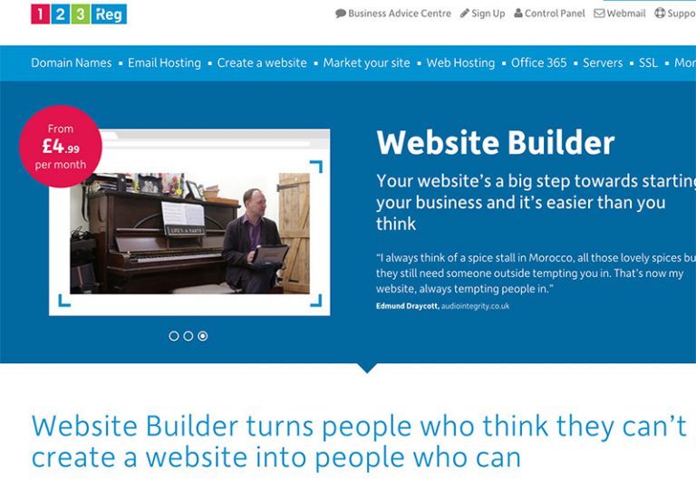
There are many websites out there that offer website builder software, from the super simple 123-reg website builder at £4.99 a month all the way to some of the supercharged megasite builders like Wix and Squarespace.
For very small businesses, sole traders etc, DIY website builders can offer a very attractive solution if implemented correctly. All of these solutions are capable of creating great results – although you will still need to have at least a basic grasp of technical and design principles if you don’t want to end up with a hot rainbow coloured mess.
Main Advantages of DIY Websites
1. They are incredibly cost effective and promise an instant “switch on” ability if you have access to the domain already. Some are available for a few pounds per month, including domain and file hosting, and this is very compelling for anyone wanting to dip their toes in the world of cheap web design.
2. They can produce stunning results if you stick to the pre-designed templates. Nowadays we are all accustomed to a relatively consistent layout for websites. We expect a logo top left, we expect a menu bar at the top, we expect a footer. This one-size fits all approach to layouts isn’t foolproof, but we have built up a common visual language of what we expect a website to look like it, and wavering from this too much can prove disastrous for usability. A good book to read on this subject is “Don’t Make Me Think” by Steve Krug.
3. Anyone Can build a website provided you have some basic design fluency and the most basic of IT skills. If you can edit Facebook pages, you can probably build a website. But beware – there’s a lot of detail in knowing about image resolutions, responsive grids, image formats, nuclear kill switches etc. that isn’t necessarily handled by your mega-building site…
Sometimes it goes wrong though…
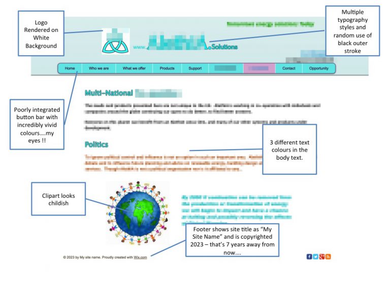
It doesn’t always work out as intended though. Have a look at this website that we were asked to re-design. I have blurred out the details to avoid embarrassment. And lawyers letters.
Now design is subjective, and whilst the colours in the page above look totally abhorrent to my eyes, to the person responsible for designing the site they may be the most pleasing combination possible. There are at least 5 different colours for the typography though – thats the digital equivalent of writing using one of those funky 4 colour biros – fine for a kid’s drawing but would you use that technique to design a company brochure ? Thought not…
Need some more help? Here’s a few DIY Website Design tips to keep you on the right side
1. Keep It Simple, Stupid (KISS). This was the favourite phrase of my first boss, and it rings true. Keep your site simple and keep your layout clean.
2. Never Cross the streams. If you are using photographic imagery on your website, stick to it. Suddenly introducing a piece of flat illustration or some Microsoft clip-art will confuse your layout. And my eyes.
3. Get someone to proofread it. Thrice. I know of at least one professional website for a national company that has glaring spelling mistakes on its site and no one has picked it up yet. Don’t be that guy!
4. Animate sparingly. A lot of the better DIY website builders have neat animated effects – a bit like powerpoint transitions. They are completely useless. Nobody will be impressed if you can make a logo spin in 2D just for the sake of it. Subtle fades, wipes and bounces for images are ok as long as they are subtle
These tips will help you avoid the pitfalls that are all too easy to encounter. With my sales hat on, I am duty bound to suggest that of course the superior solution is always to come to a professional firm, like us. You’d be surprised at how cost and time effective we can be. But if you have persevered with a DIY website, well done for giving it a go, and if you encounter any problems, drop us a line we’d be happy to advise.
